Tribus
Brand identity for a streetwear brand — wordmark, logomark, visual assets, color system.

Tribus is a streetwear brand built on the idea of tribe — belonging, identity, and instinct.
The visual language aims to merge the raw symbolism of tribal spirit animals with the restraint of minimal, everyday streetwear.
- Spirit Animals
- Minimalism
- Impact
Logotype
Geometric felt safe. Angular felt aggressive.
Custom-built lettering split the difference — structured, with an edge of its own.

Symbol System
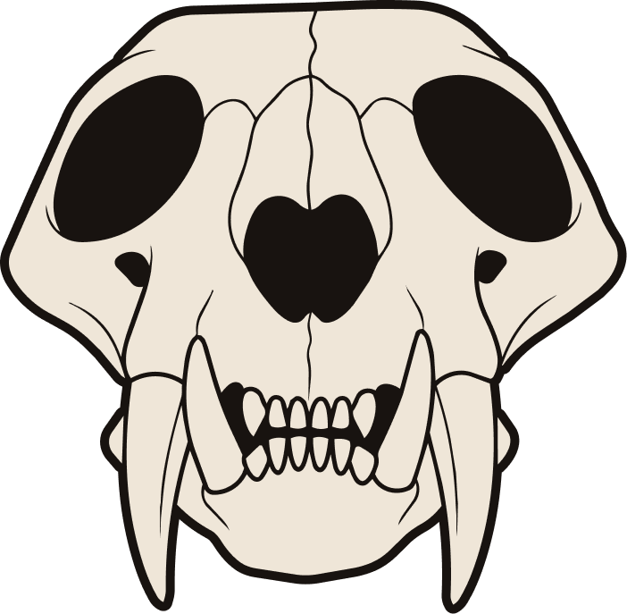
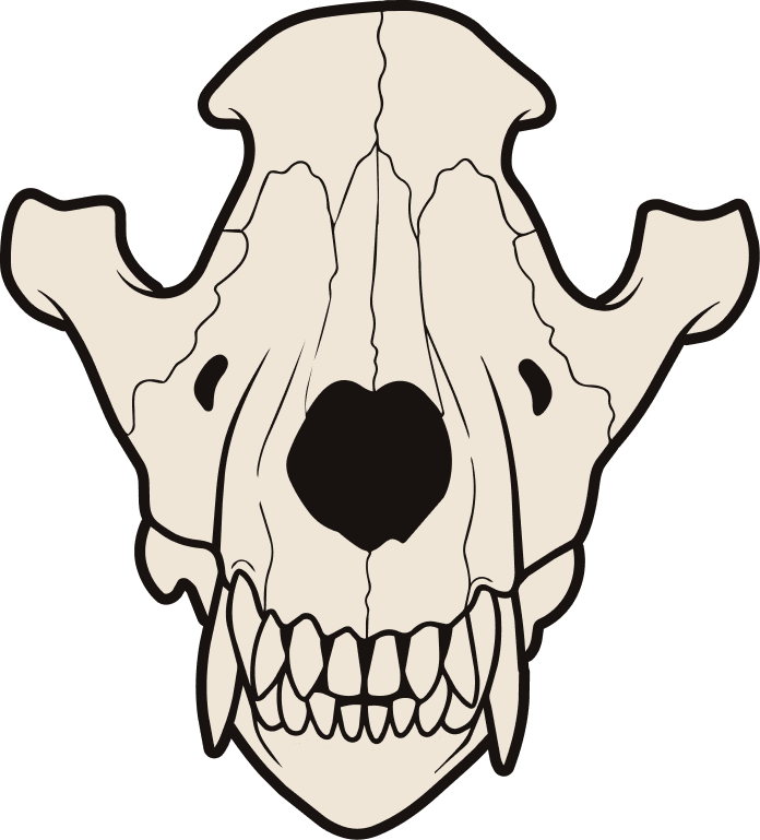
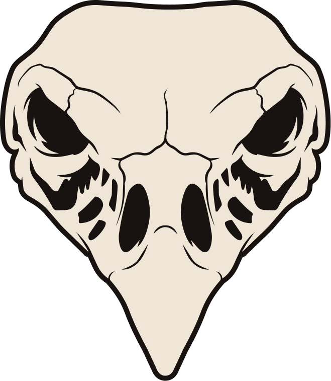
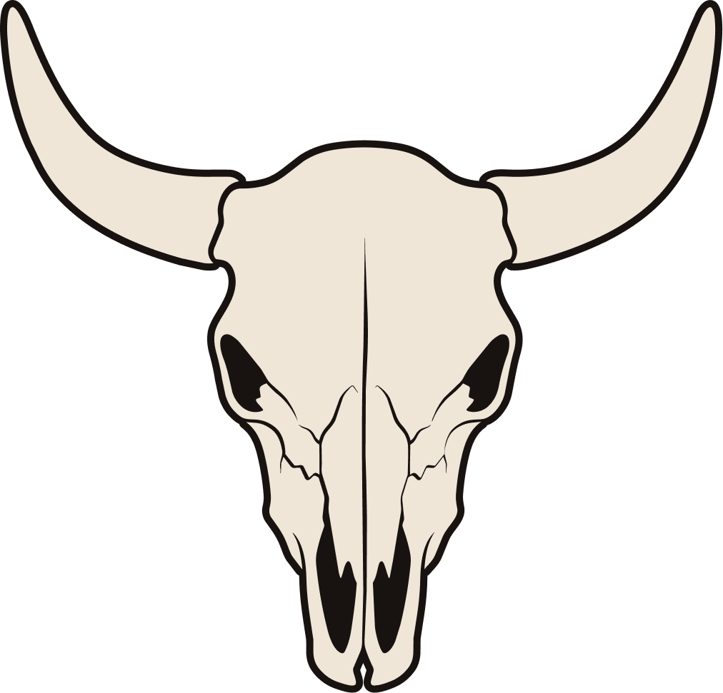
Four spirit animals, four facets of the brand.
Chose skull motifs over literal animal illustrations to keep the tone spiritual rather than literal wildlife branding.
- Tiger · power, courage
- Wolf · instinct, loyalty
- Vulture · rebirth, patience
- Bison · strength, resilience


Color Palette
Four earth-rooted tones, used with restraint. Skipped the expected loud primary reds and blacks of typical streetwear.
Clay does that job instead, without leaning into cliché.
— Bone / Pitch · structural base
— Clay · signature tone
— Smoked Turquoise · single accent, used sparingly
Results


MARKETING CAMPAIGN ASSETS
MOCK LAUNCH CAMPAIGNA mock launch campaign showing the identity at work across real marketing formats.
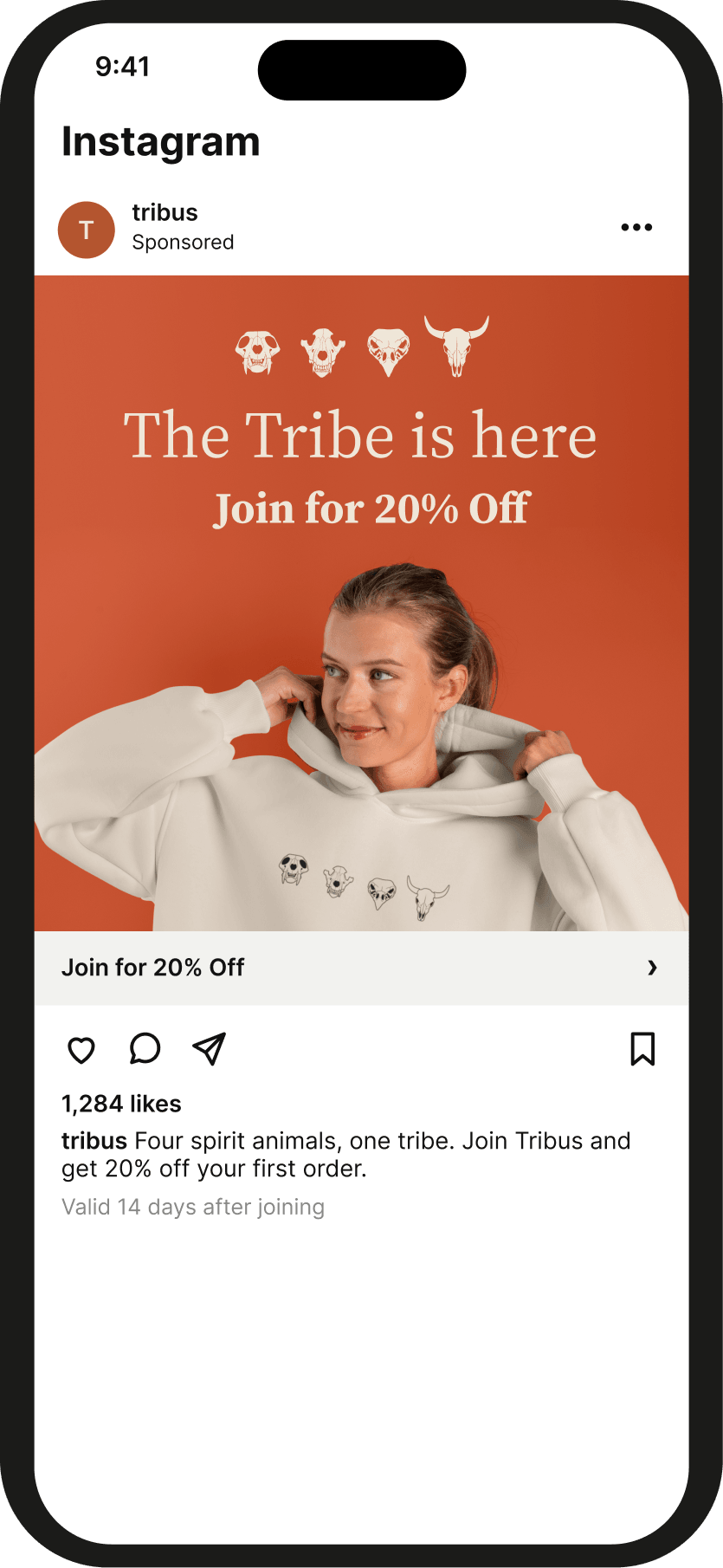
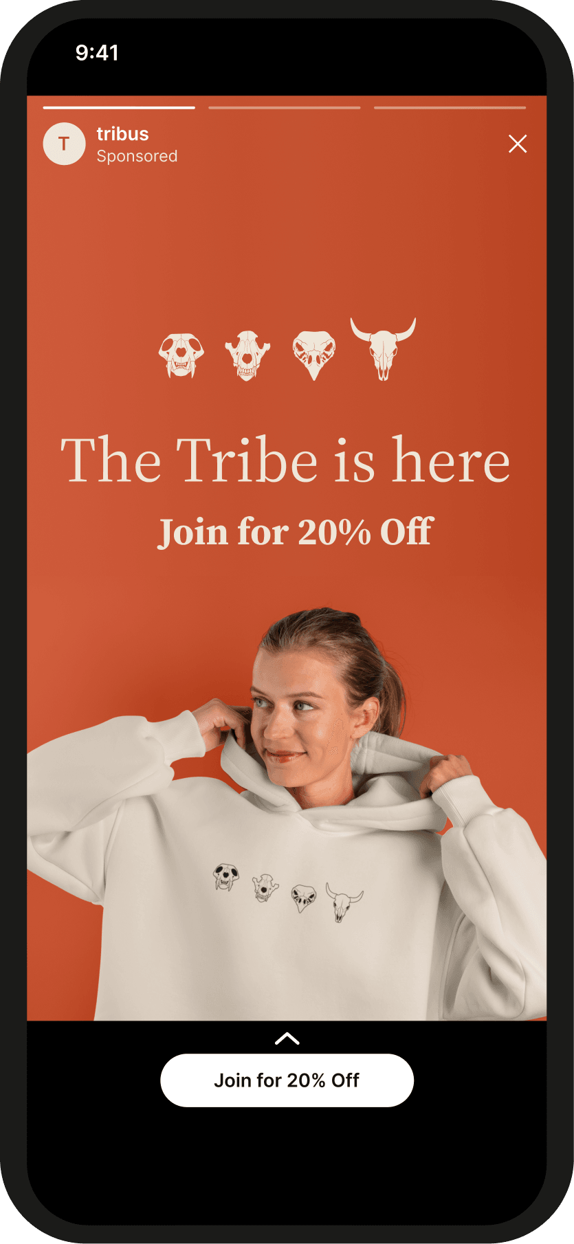
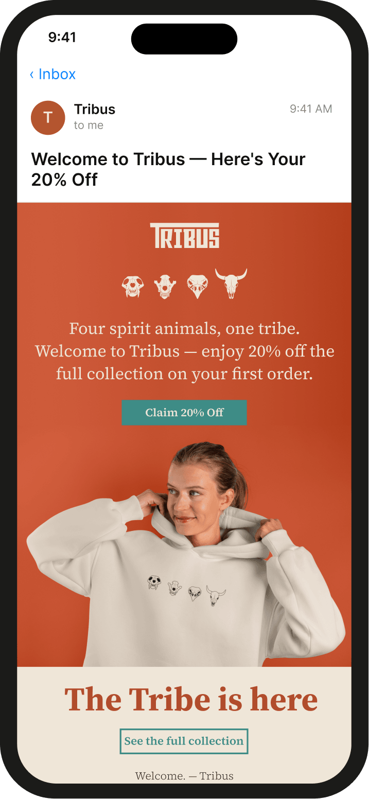
Two stages, one promise — “The tribe is here”: ads bring new people in with 20% off their first order, and the welcome email delivers it.
Social ads
Stage 1 — acquisition. Instagram and Facebook ads meet people new to the brand and invite them to join for 20% off.
- Feed post · 1080 × 1080
- Story · 1080 × 1920


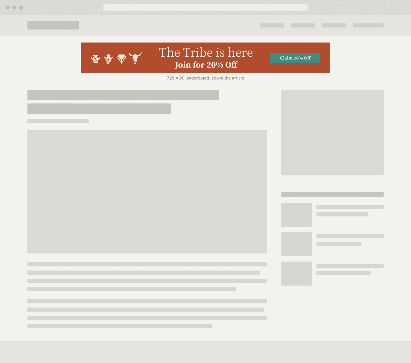
Display ads
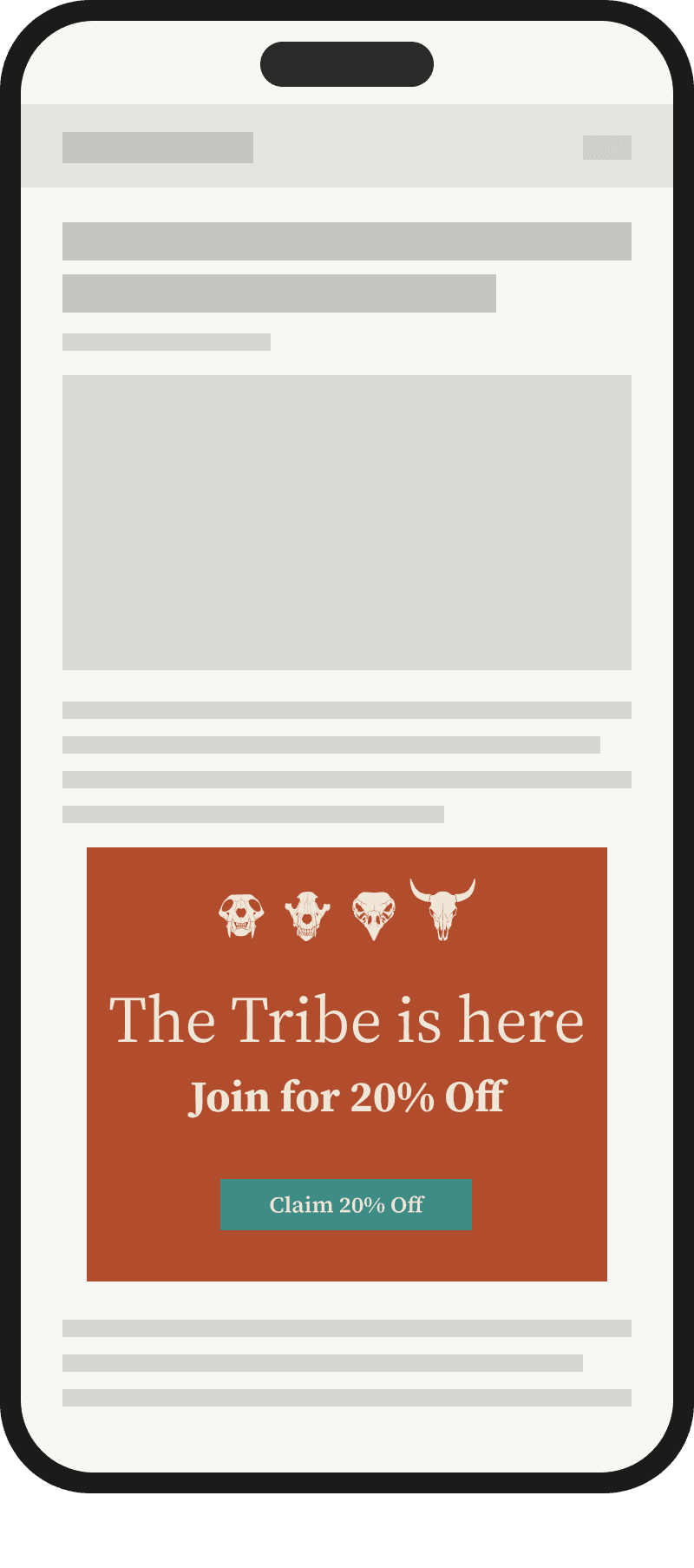
The same offer on Google Display, placed where people read: a leaderboard above the article on desktop, a medium rectangle between paragraphs on mobile.
- Leaderboard · 728 × 90
- Medium rectangle · 300 × 250


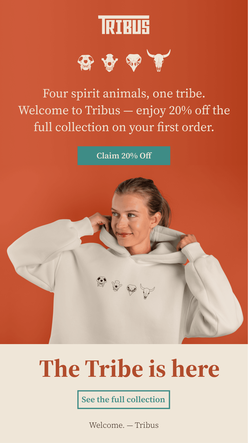
Welcome email
Stage 2 — activation. Sent right after signup, it delivers the reward: 20% off the first order, valid for 14 days.
- Welcome email · inbox
- Welcome email · full length